Pages

Sunday 28 February 2021

Creatively cropped


Amaryllis - or should it be Hippeastrum?
from a watercolour sketch by Teresa Newham

When I planted up the bulb given to me for Christmas, it soon took over the windowsill in our small front bedroom; a splendid Amaryllis (or Hippeastrum, according to the RHS).  It was a great subject to paint, but far too large to move. I would have to do some location sketching in my own house . . .


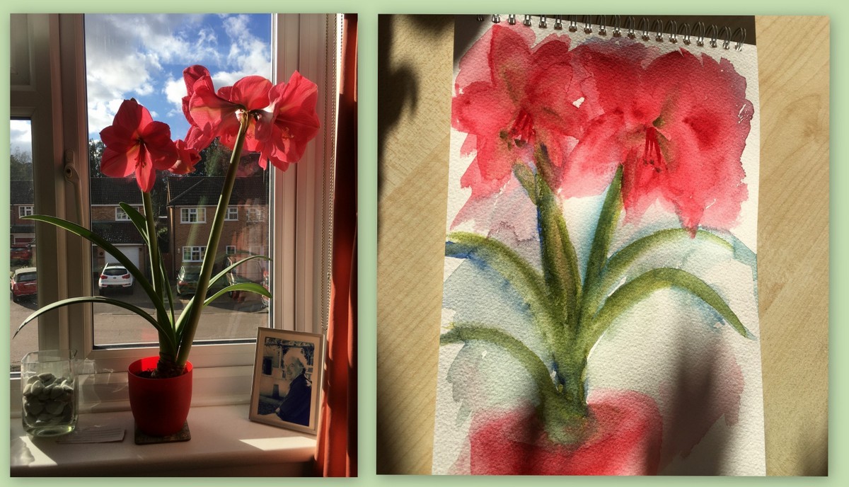
the inspiration and the whole sketch
© Teresa Newham

I really enjoyed getting my watercolours out again after so long and sloshed away with abandon.  I could easily have put the sketch in a drawer and forgotten about it, but I realised that I could crop it into a piece which I might be able to frame. I could certainly make it into a greetings card.


My Mother's Roses
watercolour sketch by Teresa Newham

I first learnt this lesson with My Mother's Roses, a watercolour sketch which lives my studio (read the story behind the painting here). It's one of my favourites - I smile every time I look at it. I framed Purple Crocus (below) in a hurry to fill a gap after I sold a piece during an Open Studios.  It went to a new home itself shortly afterwards.


Purple Crocus
watercolour sketch by Teresa Newham

This jolly yellow frame was another Christmas present and needed something lively to fill it.  So I leafed through my old watercolours again, and now these cheerful daffodils brighten up my dining room. You can't go wrong with a bit of creative cropping . . .


Daffodils
watercolour sketch by Teresa Newham


Saturday 13 February 2021

Learning to love Japanese woodblock


my second Japanese woodblock print
© Teresa Newham

I recently had another Japanese woodblock print session, after tidying up the original blocks from the first one.  They'd scrubbed up well, but it was obvious when I looked at the registration prints from my original attempt that I needed to clear away some more.


evaluating the blocks after the first print session
© Teresa Newham

That done, it was time to prepare the damp pack. Luckily I had plenty of notes to check in case I'd forgotten something vital  -  whichI did several times throughout the whole process, because the Japanese woodblock technique isn't second nature to me yet . . .


preparing a damp pack
© Teresa Newham

I used gouache as the print medium. Even while I was making trash prints and taking impressions on newsprint to check the colours and the registration, I could see that the colours were truer than I'd achieved with watercolour.


the colours were definitely truer with gouache
© Teresa Newham

Despite my best efforts, I still managed to over-ink the blocks - although I did use less ink than previously.  I'm too keen to get results straight away, and will have to get used to the idea that bright colours are best achieved by printing one layer a couple of times.


printing the various layers
© Teresa Newham

Finally I had six prints on three different washi papers. To dry, they go between sheets of clean newsprint for an hour under a light weight, and then under a pile of books for a few days, layered between sheets of blotting paper, which is changed daily.


placing the prints between layers of clean newsprint
© Teresa Newham

It's true - everything about this process is a faff, but I shall do more. At the moment, however, I have lots of ideas for linocuts, too, so I will set Japanese Woodblock aside for a while. Just as well I made those notes!


the finished prints on three different types of washi paper
© Teresa Newham