|
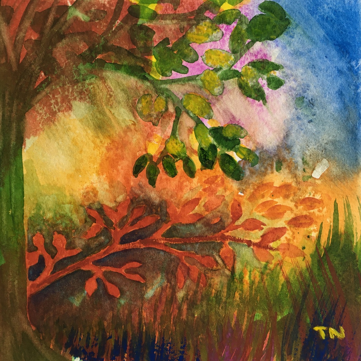
Skelligs Golden Light
reduction linocut series by Teresa Newham |
August is the month when I usually prepare for
#HertsOpenStudios - mounting, framing, sending out brochures and generally getting geared up to receive the general public. This year, however, I've been somewhat distracted by the creation of a reduction linocut I've called
Skelligs Golden Light.
 |
the sketch and the photo which inspired it
© Teresa Newham |
The photo I took inspiration from was blue, and I had in mind a range of blues from palest pale to dramatic dark, with a mysterious misty sky. Yet I kept recalling that view of the Skelligs when the weather around the rocks is clearer than that where you're standing on the Kerry mainland.
 |
the Skelligs, emerging
© Teresa Newham |
I decided to lay down some yellow first, and then a light grey as a good contrast. It worked - but I was using so much extender that the yellow showed through the clouds. I wished I hadn't printed the yellow, but I had; and I wished I hadn't cut the clouds, but I had - so I would have to make the best of it!
 |
using different colours on different parts of the print
© Teresa Newham |
By the time I printed the mid grey, I was convinced I would have to mount this linocut so the clouds didn't show. Luckily the Skelligs themselves looked great . . . on impulse I printed a thin layer of white ink over the clouds, just to see what would happen.
 |
slowly the image became clearer
© Teresa Newham |
A dark layer was needed for Little Skellig, and I wanted the foreground to be darker too. After I'd printed up a couple I realised that adding some of that dark colour on the clouds would balance the picture. Would a thin layer of ink with lots of extender print OK on the white?
 |
when the plate could be an artwork in itself
© Teresa Newham |
I wasn't convinced, but ploughed on anyway - sometimes you just have to keep going. The plate itself looked a promising piece of artwork in its own right, and as I carried on, the results became more encouraging.
 |
the finished prints laid out for inspection
© Teresa Newham |
At this stage I still had most of the impressions I started with, but they won't all make the cut. The variations on the rest means that this will be a series rather than an edition. It's turned out far better than I expected when I was halfway through, and I've learned a lot in the process. Better get back to my framing . . .
 |
one of the finished prints
© Teresa Newham |