Pages

Showing posts with label rock salt. Show all posts

Saturday, 30 November 2019

Creation


Creation
watercolour with salt resist by Teresa Newham

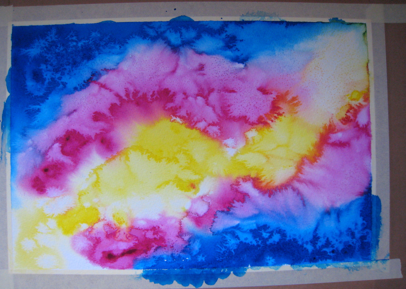
Enthused by the colour palette of October I & II, I recently made an experimental salt painting with many of the same colours: Cobalt Blue, Cobalt Violet, Venetian Red, Gold Ochre and Raw Sienna, with some Cerulean Blue thrown in for good measure.


the blank paper awaits
© Teresa Newham

It took all my self-control not to interfere as the initial washes marched across the paper, pooling at the edges.  I crushed some rock salt in a pestle and mortar to give some variety to the resist, and scattered it only where the paint had dried to a sheen.


the bottom layer emerges . . .
© Teresa Newham

For the top layer I used mostly Ultramarine, with a lot of water sprayed from a perfume atomiser my Mum used to spray onto her watercolours.  Again, I only added salt in the areas which I judged could take it - to avoid the risk of the salt dissolving.


. . . as does the top layer
© Teresa Newham

I was really pleased with the effects once the paint had dried, but not for the first time I had no idea what to call the finished piece. My husband suggested the title 'Creation', so Creation it is.  Highly appropriate, as this painting has virtually created itself!


the finished painting reveals itself
© Teresa Newham


Tuesday, 15 October 2019

fiery flowers for One Square Foot


August I ~ watercolour & salt
Teresa Newham

Back in August, I set out to paint a piece which had to measure exactly one foot square, including any framing, for an art exhibition* in Hitchin. As the exhibition was to take place in October, I had in mind something autumnal involving fallen leaves, perhaps with a touch of copper or gold printmaking ink.


brightly coloured initial washes & salt . . .
© Teresa Newham

My subconscious, however, had other ideas, and presented me with a palette so vividly Mediterranean that I had no idea what to do with it, until I took half of the initial washes off with damp kitchen paper and turned the whole thing upside down.


. . . dried, toned down & turned around
© Teresa Newham

I was making two paintings, in the hope that at least one of them would work.  I added in some trunks and foliage using Permanent Sap Green, to contrast with the Quinacridone Red, Transparent Yellow and Cobalt Turquoise of the base layer.


trunks and foliage taking shape
© Teresa Newham

The salt pattern suggested sunflowers, and I thought some white daisies would look good in the cool areas.  I made the flowers by painting the negative space around them - something I don't do much, but I'd been reading Anne Blockley's Watercolour Workshop and some of it must have stuck . . .


flowers emerging from the washes
© Teresa Newham

Going with the flow, I adjusted the paintings as I went, wondering where these fiery tones had some from. Then the penny dropped - they were the exact colours of the materials we'd been using at my amateur operatic group to make fairy costumes!


the finished paintings
© Teresa Newham
.
The pictures only came properly to life when I added the centres to the flowers. There's a rich glow to these pieces which I rather like.  I had no idea what to call them, so they've ended up as August I and August II.  I hope to do more like these - there are twelve months in the year, after all . . .


August II ~ watercolour & salt
Teresa Newham

*  The charity exhibition "100 Square Feet" in aid of the Motor Neurone Disease Association will run until 2nd November 2019 at The Art Nest, 4-5 West Alley, Hitchin SG5 1EG.


Monday, 29 April 2019

Into the Light


Into the Light
watercolour by Teresa Newham

Much to my surprise, I found time during Lent to do another watercolour painting in which I used salt to create some special effects.  Only one attempt went in the bin this time - when will I learn not to wet the paper too thoroughly? - and I was able to get going with some interesting washes fairly quickly.


laying down various washes
© Teresa Newham

We'd recently made a trip to Kew Gardens - my first, as it happens - where the Cherry Tree walk must have made a huge impression on me, because it started, quite literally, to seep into the subject of this painting. Especially when I found myself holding the whole thing vertically to get that watercolour running . . .


the salt adding magic of its own
© Teresa Newham

When I decided that the painting was finished, I realised that it's a perfect description of how I've been feeling over the last few months.  And I'm pleased to say that there is light at the end of the tunnel!


the finished painting, still taped to the board
© Teresa Newham


Tuesday, 27 November 2018

salt painting blues


the finished painting - or is it?
© Teresa Newham

I'm not sure why this one was such a a struggle, but the signs were ominous from the beginning: trying my chosen four colours on a piece of scrap, I found the French Ultramarine and Winsor Blue (green shade) indistinguishable, and the Cobalt Turquoise far too green. As I was almost out of Cobalt Blue, I dashed to Artscape and picked up some Cobalt Turquoise Light at the same time.  It wasn't a good start . .


I took a while to choose the colours
© Teresa Newham

I wetted a piece of 300gsm Daler Rowney watercolour paper and taped it to a board.  It dried thoroughly, and I laid down an initial wash of Cerulean and Cobalt Turquoise. But somehow everything became too wet - when I added the rock salt, it started to dissolve.


initial washes . . .
© Teresa Newham

So I did something I almost never do - chucked the painting in the bin and began again. I used Arches 600 gsm (no stretching required), laid down the initial wash for a second time, and sprinkled on the salt.  I can't recall now what I didn't like about that attempt, but it ended up in the bin with the first one . . .


. . . with salt added
© Teresa Newham

Number three ran into trouble almost immediately - but Arches is expensive and I couldn't bring myself to throw it away.  Besides, the bin was full.  So I wiped off the paint and let the paper dry - which gave me a chance to calm down and remember that salt painting requires patience.  I turned the paper over, determined to let things flow.


salt on the second layer of washes
© Teresa Newham

Finally I managed to get the colours down and the salt on without any drama.  When the paint dried, I removed the salt and added washes of Cobalt Blue and French Ultramarine. I sprinkled on more salt, and took that off when the whole thing was dry. I assume the painting is finished - I don't want to touch it again.  And I'd welcome any suggestions for a title - so over to you!


once everything dried, I removed the salt
© Teresa Newham


Friday, 12 January 2018

The Dawn of Time


The Dawn of Time
© Teresa Newham

For some months I've wanted to make another rock salt painting along the lines of Cosmos - something simple and tasteful in Raw Sienna and Cerulean Blue, perhaps with a touch of Cobalt Blue and some gold printmaking ink. I even had a name for it: The Dawn of Time.


the most difficult part - getting started!
© Teresa Newham

This week I gave it a go, using 300lb Arches watercolour paper.  I lobbed on a lot of water with a big brush, plenty of colour, and a great deal of salt.  Then I added some more water with a spray for good measure, and walked away to let everything dry off.


the first layer
© Teresa Newham

When I scraped off the salt the next day, I realised the Cerulean Blue didn't work on its own, but would add depth to any washes on top of it; so I added more water, more Cobalt Blue and so much salt I could almost taste it . . .


more Cobalt Blue and salt
© Teresa Newham

Once again I left the painting to thoroughly dry overnight.  When I prised off the second layer of salt - not an easy job, as it was clinging tenaciously to the paper - I realised a transparent green was needed. The only one to hand was Viridian, so I wetted the paper yet again, added colour, salt and spray, and stood the painting upright for a while to see what would happen.


Viridian enters the mix
© Teresa Newham

The following day I applied another, weaker Cobalt wash and did a lot of spraying and waving the whole thing about to get the final effect (no need for printmaking ink!). The original title, The Dawn of Time, is vague enough to mean almost anything.  So I kept it -  because I have no idea what this painting is about . . .


the final result
© Teresa Newham


Thursday, 4 February 2016

. . . and the tang of the sea

Skellig Dawn
original watercolour by Teresa Newham

Perhaps it was the salt that made me decide to paint a seascape next?  After my experiments with Cosmos it seemed like a natural progression.  This time I chose Cerulean blue, Quinacridone Magenta, Raw Sienna, and Phthalo Blue, and laid them - not quite as randomly as last time - on pre-wetted paper.


paint and salt, flowing
© Teresa Newham

Once everything was dry and the salt removed, I added another blue wash over the sky and sea areas, and some more salt, which produced this:

a second layer of washes
© Teresa Newham

Using a large brush, I dabbed in the shape of the Skellig rocks in Raw Sienna, then went over them again in magenta and finally blue, brushing in a firmer horizon as I did so.


Skelligs on the horizon
© Teresa Newham
Still not happy, I added another wash over the sea.  Even that didn't make me like this painting, although my husband loved it.  Secretly, I resolved to chuck it in the bin when his back was turned.

Skellig Dawn, with mount
© Teresa Newham

And yet, and yet . . . somehow it stayed taped to its board in the studio for another week, even though I was convinced I was going to throw it away.  But it worked its magic somehow - and now I rather like it!


Thursday, 21 January 2016

a pinch of salt . . .

Cosmos
original watercolour by Teresa Newham
I recently took it into my head to create an abstract painting using watercolour and rock salt.  This was one of the techniques I was shown several years ago during a short course introduction to watercolour at Central St Martins - it produced fantastic results but I hadn't tried it since.

splashing & sprinkling
© Teresa Newham

Rather than use my best paper, I stretched some 300gsm Arches, wetted it, and dropped in Transparent Yellow, Quinacridone Magenta, and some Winsor Blue (Green Shade).  Also known as Phthalo Blue, it's a colour I use a lot in printmaking but rarely for watercolours.   As the paint spread, I sprinkled salt over the paper and wetted it again in places with a spray.  Then I walked away firmly, without looking back.

how the base layer dried
© Teresa Newham

Next morning the painting was quite different, with some amazing patterns.  I carefully brushed away every scrap of salt with my fingertips.  As the overall effect was a little gaudy, I covered the whole lot with a wash of ultramarine, graduating towards the centre and out again.   I sprinkled more salt onto the paper, used the spray a bit, and once again turned my back on it.

the ultramarine layer, with salt
© Teresa Newham
I couldn't resist taking a look from time to time at the colours marching across the paper - there were some vibrant hues emerging that usually only appear in the water I use to rinse the brushes - but again I didn't touch it until the following morning.  By now the salt had absorbed so much pigment that it resembled those coloured sugar crystals you can buy for your coffee - these ones, however, were strictly inedible.

salt or sugar?
© Teresa Newham
Some artists say you should keep the salt in place as part of your painting.  But I wanted the effects underneath to be seen; besides, my student portfolio from that long-ago course now has a crunchy layer of salt at the bottom from my early experiments.  It does fall off eventually . . . and removing it was such a tactile experience it felt like an integral part of the creative process!

trying out a mount
© Teresa Newham
I was happy enough with the finished piece to see how it looked in a mount.  For a few days it didn't have a title, but eventually I settled on Cosmos.  Make of it what you will . . .