Pages

Showing posts with label hyacinths. Show all posts

Monday, 29 January 2018

what happens if . . . ?


Hyacinths II
original pen & wash by Teresa Newham

A number of mounted watercolours have been knocking around in my browser for a few years now, and are starting to look a bit tired.  What would happen, I wondered, if I tried to tart them up a bit?


Hyacinths I - before the makeover
© Teresa Newham

My least favourite is Hyacinths - the composition and colours have never felt quite right to me.  I thought perhaps a bit of cropping might be in order, but that wouldn't help with the colours . . .


selecting a crop
© Teresa Newham


I needed to practice on something, so I wetted the painting and carefully took off as much of the original colour as I could.  When it had dried, I mixed up strong washes of Transparent Yellow, Permanent Sap Green and Permanent Alizarin and threw caution to the winds.


have I gone too far?
© Teresa Newham

The result was intriguing - the green granulated wonderfully and a beautiful orange appeared as the Alizarin mixed with the yellow.  I painted the leaves with the green wash, added Cobalt Blue to a few of the flowers, and left the others as pale as possible.


leaves and flowers adjusted
© Teresa Newham


I'm pleased with the final result and keen to try again with a different painting.  I have specific ideas for revamping one or two others, so I'd better not let my enthusiasm run away with me!


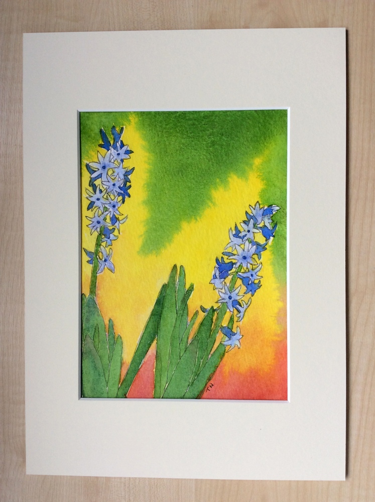
cut down and mounted
© Teresa Newham

Wednesday, 31 March 2010

a touch of Spring


white hyacinths
© Teresa Kirkpatrick 2010

Back in the cold, dark days of January I bought myself a pot of white hyacinths; the gorgeous flowers and wonderful scent hinting at the springtime to come. They looked so lovely that I got out the camera; and I was so encouraged by the outcome of this impromptu photo session that I wasted no opportunity to capture the beauty of every bowl or vase of spring flowers that entered the house.


red tulips
© Teresa Kirkpatrick 2010

These were the first photos I'd ever taken which set out to be "arty" from the beginning; I played about with some soft focus effects and deliberately concentrated on close-ups to bring out the vibrant colour and delicate features of each bloom.


yellow daffodils
© Teresa Kirkpatrick 2010

The result is a small selection of colourful and evocative flower photos which I'm hoping to exhibit at this year's Herts Open Studios in September. Meanwhile they are now available as canvas prints at the marbretherese art and photo pro gallery on Photobox.


pink tulips
© Teresa Kirkpatrick 2010

Of course, now I've been bitten by the bug, I want to do more; some are already in the pipeline. Not just flowers, either; I've a few ideas which may (or may not) come to fruition later in the year. We shall see!

Sunday, 15 March 2009

Swanning Around


Swan
© Teresa Kirkpatrick 2009

I've recently completed a couple of paintings which got me thinking about inspiration and ideas, and where they come from. This swan (of which I am inordinately proud) was painted from a photo taken over a year ago in the RHS Garden at Wisley. I had no intention of painting a swan; instead I did a less-than-successful depiction of some ducks on the ice of Harpenden Ponds. Although the painting didn't work, I discovered I enjoy painting birds - hence the swan. It's not like the photo in terms of colour - it was a grey day and I've rendered it in cobalt blue and raw sienna -but very like in form. And I've managed to paint water successfully at last!


hyacinths
© Teresa Kirkpatrick 2009

This little picture, on the other hand, was painted from life. The tall bloom at the back had flopped, and is held up by a stick. I sketched and underpainted it in the morning and when I came back to it in the afternoon, not only had the light changed but the flower on the right had grown! Having got the hyacinths & bowl how I wanted them, on the spur of the moment I mixed my three colours (cobalt blue, alizarin crimson and indian yellow) into a neutral beige and crudely overpainted the background - which had originally been pale yellow) - with a large flat brush. I like to think that not painting right up to the edges of the flowers has given them a backlit effect. I could pretend that I intended the horizontal strokes on the background to be a counterpoint to the vertical thrust of the flowers but, like a lot of my work, that's a happy accident . . .

I like the immediacy of this painting, but what you gain in vibrancy you lose in composition. I soon realised it was too close to the top of the paper (and slightly to the left) but having started, I didn't want to stop. Oh well!